Column 17: An inspiring logo
Instant recognition – that’s the role of a company’s visual identity. We all recognize the five Olympic rings, the Lacoste alligator and the Mercedes Benz three-pointed star at a glance. OK, so Lassonde isn’t quite in that league – yet.
But as the Company secured its foothold in the market, it felt the need to develop its corporate identity. With the creation of a Marketing department, which handled public relations, the project got underway. In 1978 Lassonde entrusted the design of its logo to the firm of Georges Huel et associés.
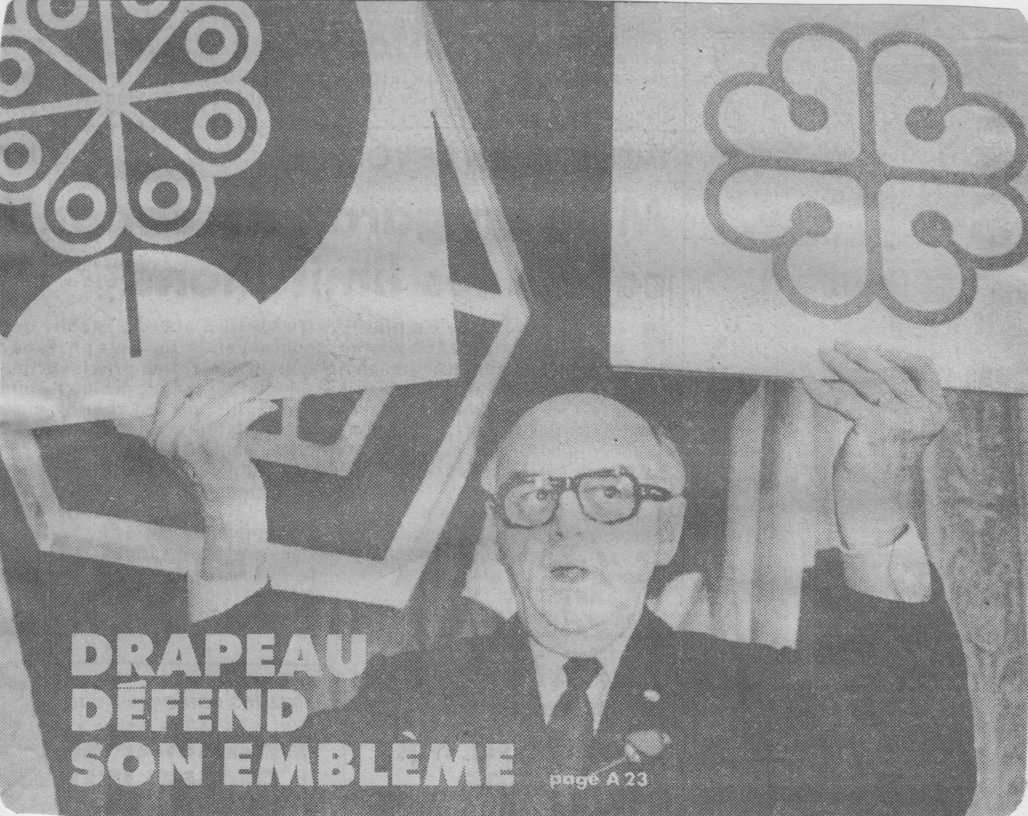
The logo was red, of course, like Rougemont and like an apple. The lower half, which is reversed out, depicts the mountain. In the centre there is a tree or a flower, which gives rise to the agribusiness products processed by Lassonde. The circular form evokes the sun, which makes everything grow. Taken as a whole, the logo conveys the origin of the Company, its business activities and its component parts, symbolized by the petals. The Lassonde logo then began to appear on all the company’s products, packaging and documents.
Unintentionally, the Company’s visual identity provoked controversy in the media and anger on the part of Montreal’s mayor at the time. According to the journalists, the reason was that the city’s new logo commissioned by Jean Drapeau in 1981 bore too close a resemblance to Lassonde’s. Had the mayor been duped by a designer who decided to recycle his clever ideas? History has not disclosed the answer, but Montreal and Lassonde both still had the same logos three decades later.
Next column: A revolutionary process…